How user friendly is your city?
When you think about user manuals what are your first thoughts? Odds are they’ll involve pamphlets in five languages about how to reset a garage door opener, or efficient Scandanavian pictograms describing how to put together your new couch.
What about cities? Odds are you’re living in one right now, and you’ve probably lived in at least one for a significant portion of your life.
If so many of us use cities, then where are the user manuals?
It turns out that effectively there are user manuals for people living in cities, although these “manuals” are an amalgamation of customs, urban planning (or lack thereof), and local legal codes. We generally take these user manuals for granted when we grow up in a particular city, and typically navigate what we need to do, in order to do what we want, without even thinking about how complicated the process really is. And, at the very least, if our own navigation skills fail, we know someone who can help us out.
But, imagine that you pick up and move out of your culture, language, and country. What happens now? About five years ago, I joined the ranks of the 200+ million migrants on planet Earth and moved to Seoul. This was a disorienting experience. I felt like I was four years old again because I had lost so many of these social landmarks. Imagine being illiterate and ordering food in a restaurant. You’ll grab onto whatever other information you can get, such as price. When my and my wife used this strategy, it usually worked, but occasionally we’d end up with a bottle of wine for dinner when the wine happened to be the price of a reasonable meal. I found that things I’d normally be able to resolve with five minutes on the internet, or with a phone call, such as finding a local gym, could turn into days of wandering the streets looking for vaguely gym-shaped buildings.
Over time, with a lot of effort, I started to piece together my own user’s guide to Seoul. For instance, I learned to ask for opening or closing time by miming a clock. I asked co-workers what the deal was with all the barber poles, and used sites such as Meetup to hang out with people practicing their English in some of the most post-ironic places on Earth.
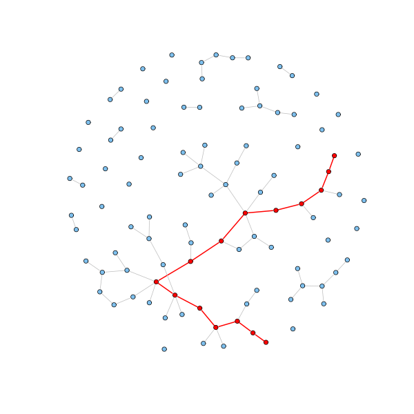
I can describe the process of trying to get around Seoul in the language of graph theory. I was a node, trying to follow the links between other nodes (people or places or services) to achieve some outcome (find a gym, or a meal that wasn’t a bottle of wine). In order to survive, in one way or other, all of the hundreds of thousands of immigrants in Seoul were doing the same thing.yIn fact, everyone in Seoul were getting around, using their connections to the city and other people in exactly the same way. There is a big difference between the way an immigrant and a native can navigate their map of a city, though. Given barriers in language, culture, and general background knowledge, an average migrant is likely to need a much longer chain of links to get where they need to go than the average native of Seoul. For instance, instead of directly asking someone they know about the best kimchi soup restaurant, a migrant might need to ask a well connected friend, who then asks a kimchi soup expert. Social network scientists have a metric for this, called the network diameter. The network diameter is the average distance, measured in links, between any two random nodes in a network. In Seoul, other migrants and were all using our networks of social linkages as our discovery tool for discovering the rules and rewards of the city. Over time, people construct their networks to become more extensive and efficient. A direct prediction of this process is that the average number of links that a user of a city needs to conduct a given task should drop, the longer they have lived in that city.
Now, what if we all had access to the different maps that people use in a city? We can be pretty sure that large data consuming institutions, such as Facebook or the NSA, have already been doing this for years. You could personally try and collect the data of people’s personal networksby mapping user public queries and networks.. But, even without knowing individual identities, you would end up with a great deal of identifiable personal data. While we may get better at managing the tensions between the efficiency of searching and connecting with our networks; and lack of privacy, and the power of big institutions, my suspicion is that it will be like the century-long search for non-addictive painkillers. We certainly found more painkillers, but also discovered that painkillers are fundamentally addictive. In a highly connected world with rapidly growing bandwidth and computational power I believe we’re going to effectively return to village life: everyone will be able to know what everyone else is up to, whether they want it or not.
Another consideration, when studying the maps that people make themselves, is being overloaded by the data. If you’ve ever seen maps made of the internet’s various parts you’ll find a lot of pretty pictures giving a rough idea of what is connected to what, but it can only be painted in broad strokes, at an abstract distance, for it to make any sense. Similarly, if we construct a composite map of everyone’s networks in a city, it will return a structure on the same order of complexity as the human brain. If we want to construct a useful map, we need to boil down the data to a handful of metrics.
The most obvious metric is network diameter. This will tell you how far apart any person is with what they want to do with their city. We can consider this a good indicator of how easy a city is to navigate, for a given person. Holding all else constant, the smaller the network diameter is, the easier it will be for a person to do the things they want to do. Consider a transportation metaphor. If you could get from Pasadena to Venice Beach with only a single train transfer, it might be an easy Sunday afternoon trip. If you need to do two train transfers, and a bus, you probably won’t bother. And of course, if you have a car, it might be only a single, simple trip (and a stop for gas), which could make any distance simple. Do you really want to go through five people to figure out how to get a debit card? Or is it easier to pay in cash? An overall “network diameter” measure of a city is of course a level of abstraction too high. There will ultimately be a series of independent network diameters within this overall connectivity of a city. While it may take a population an average of three links to figure out financial services in a city it could take five links to figure out how to access health services. While it might take five public transportation links to get between any two points in the city, it might only take one link to reach fresh groceries. An average score of four links overall for a city may be useful, but to really understand the kinds of challenges people are navigating within the city, we’ll need to look at this closer level. Once this type of data could be aggregated anyone could be able to look up how usable a city would be, for various services, before pulling up stakes and moving elsewhere.
As some of the above examples should make clear, there are likely to be different network diameters for the different people who live in a city. If you don’t have a car, moderate distances might quickly become insurmountable in a poorly connected city. What else would impact the network diameter for a given person? As my history in Seoul taught me, the amount of time someone has lived in a city will have an effect. The apparent “size” of a city will shrink, as new migrants become more familiar with their new surroundings. However, time alone won’t shrink network diameters in the same way for all people. Language will obviously shapre this process. It’s possible that the greater the differences between the native language of a person and the dominant language of their city the larger the network diameter and the more slowly it will shrink. We could test this, using one of the various measurements of the differences between languages. For, example the US Defense Language Institute has a four-tiered scale for its students, and for a native English speaker, Korean is considered one of the most difficult languages to learn. It’s possible that an American in Korea (or Korean in America) will find it harder to buid a network than someone speaking a more compatible native language.
In developing this idea I put together a list of metrics about people and cities which I think would be useful to know in trying to measure. Below is a proposed list of variables regarding people and cities which should be useful in studying the usability of various cities for various populations:
Primary language, Written fluency in primary language, Spoken fluency in primary language, Residency time in city, ProfessionSecondary language, Written fluency in secondary language(s), Spoken fluency in secondary language(s), Planned residency time in city, Home country, Ethnicity, Relationship status, Income (in local currency adjusted for PPP), Gender, Number of countries in residency history, Urban population, Prevalence of various written languages, Ethnic makeup, Median income, Urban population density, Prevalence of various spoken languages, Median education levels, Gini coefficient
Of course these metrics would probably need to be updated before trying to do any study, but they appear to be a decent place to start. The real difficult part would be to set up a method for collecting all of the relevant data. My guess, given their global ubiquity, mobile phones would be the best data collection tool.
This is my call to potential collaborators and feedback. If you’re interested in developing this idea please email me at levisimons@gmail.com .
(Originally posted here on December 5th 2014)
(Originally posted here on December 5th 2014)

Comments
Post a Comment